Key points from article :
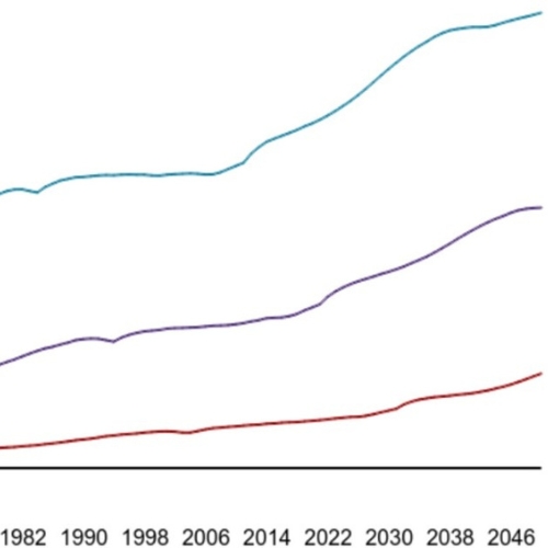
Fascinating data visualisation of life expectancy for 200 countries over 200 years.
Charts life expectancy v income over time.
From poor and sick to rich & healthy.
Highlights significant difference between continents.
Don’t blink for the dip in 1918!
COMMENT: emerging countries closely track life expectancy for a fraction of the income


